KofeteareaWhere Coffee and Tea Unite in Elegance
Logo Description
Kofetearea’s new logo exudes a sense of warmth and sophistication, redefining the coffee and tea experience. We bid farewell to the previous childish look and embrace a friendly, yet classy design. The warm, inviting yellow has been updated to a more refined, earthy hue, evoking a sense of comfort and familiarity. Additionally, we introduce a rich and elegant dark blue, symbolizing the depth and quality of our offerings. The typography is carefully crafted to exude modernity and elegance, reflecting our commitment to craftsmanship. This revamped logo perfectly encapsulates the essence of Kofetearea – a place where tradition and innovation intertwine to create an extraordinary coffee and tea experience.
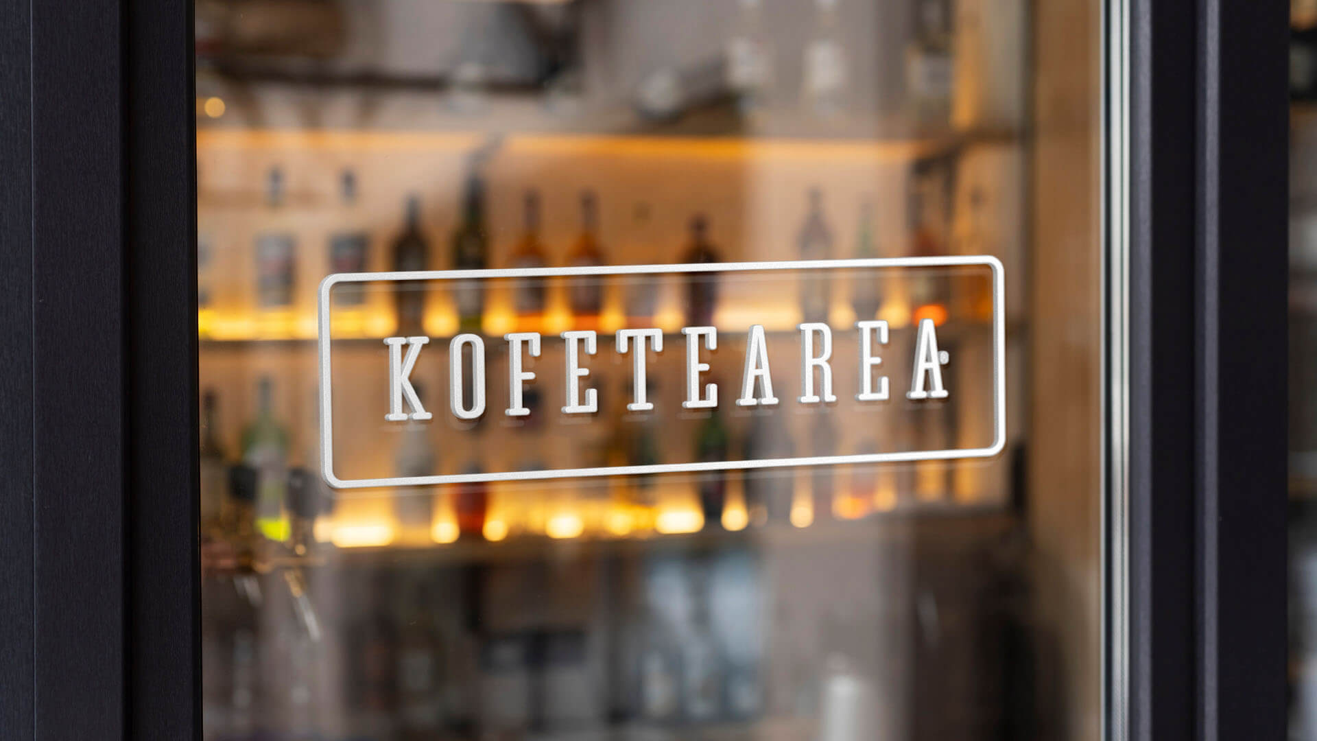
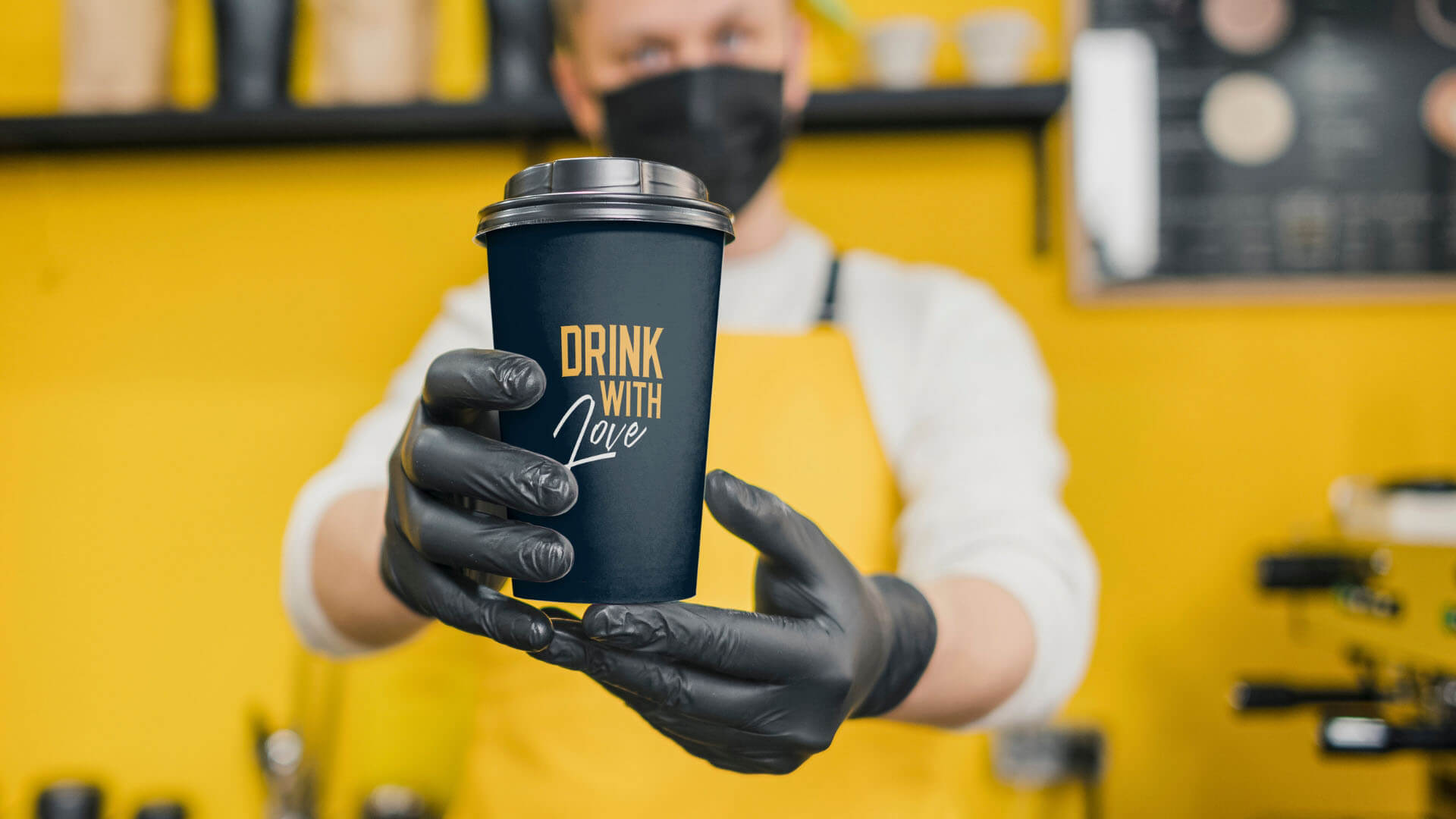
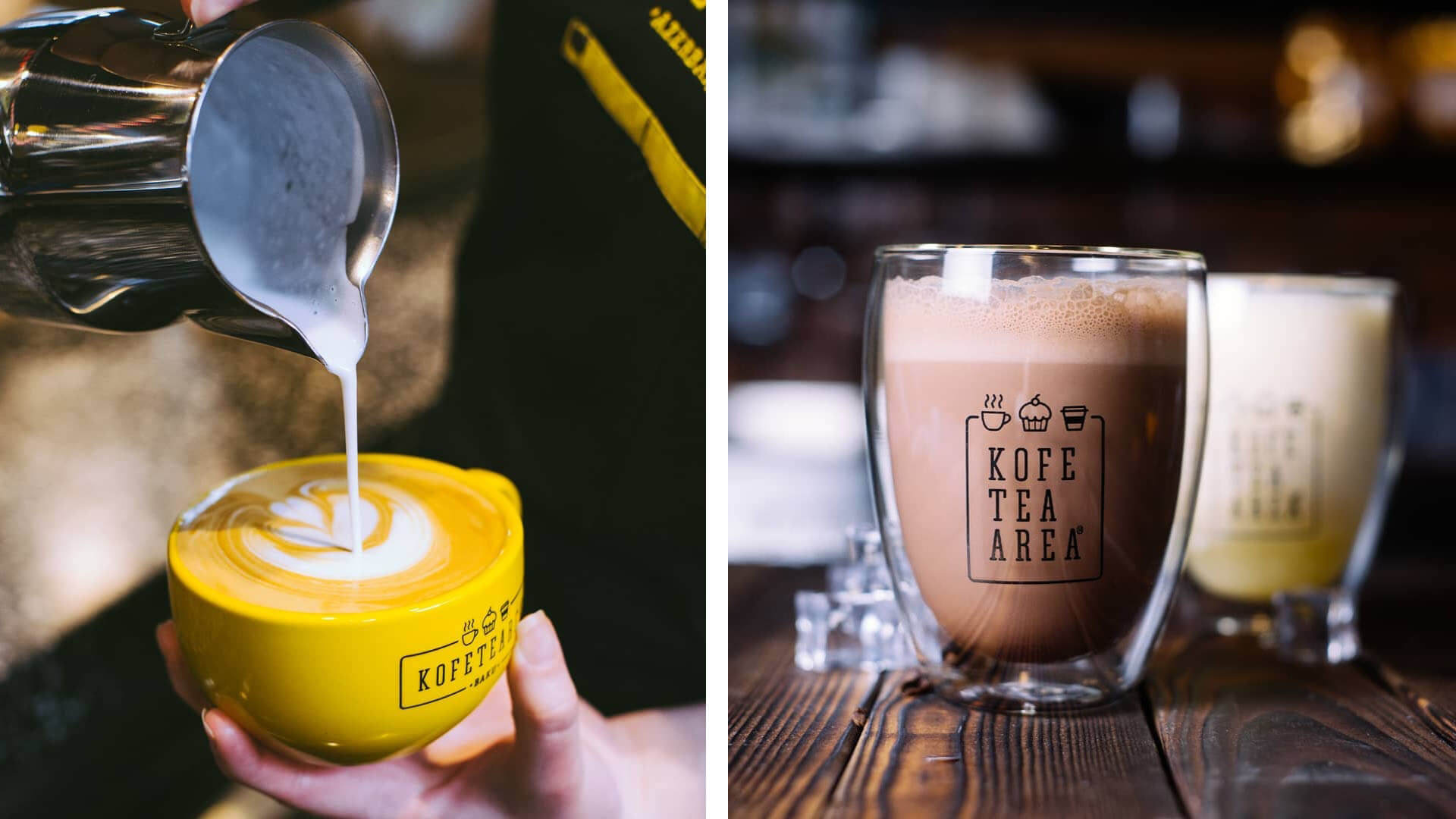
Photo Shooting
Our photo shooting captures the essence of Kofetearea’s inviting atmosphere and the artistry behind every cup we serve. Through thoughtful composition and lighting, we portray the comforting ambiance of our Coffee and Tea House, where patrons can immerse themselves in the world of rich aromas and flavorful brews. The images showcase the skillful hands of our baristas and tea masters as they passionately craft each beverage. From the delicate unfurling of tea leaves to the precise pour of a perfectly extracted espresso, our photography conveys the dedication and expertise that go into every cup. We also highlight the delectable array of pastries and delicacies that complement our beverages, adding a touch of indulgence to the overall experience. With an emphasis on warmth, elegance, and attention to detail, our photo shoot tells the captivating story of Kofetearea.
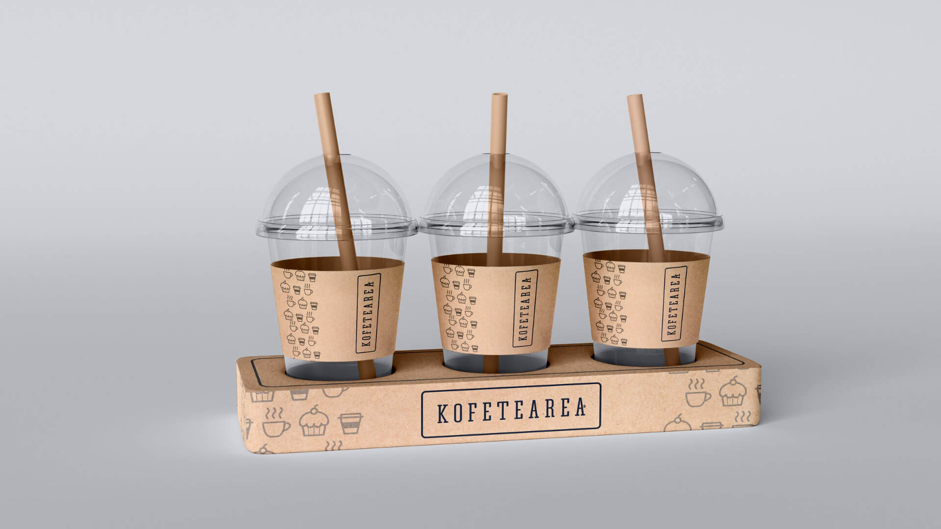
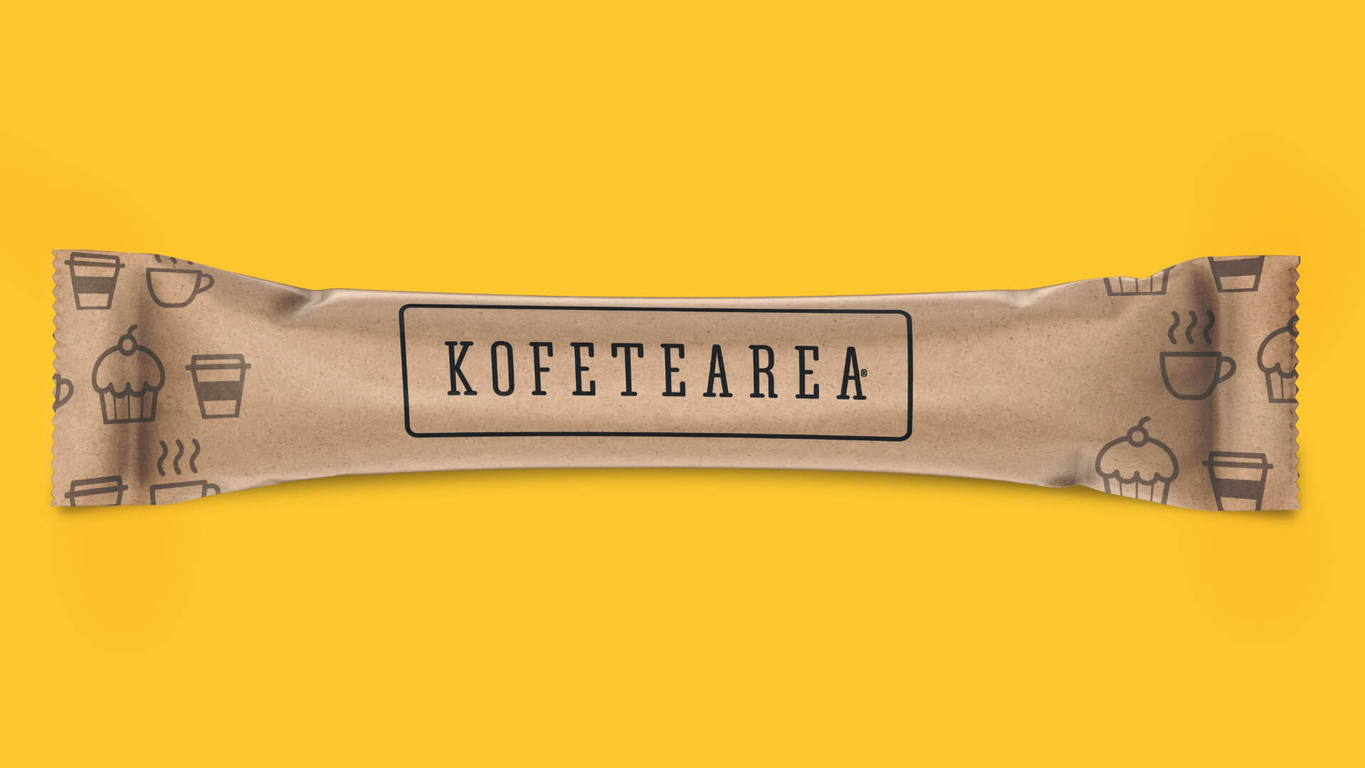
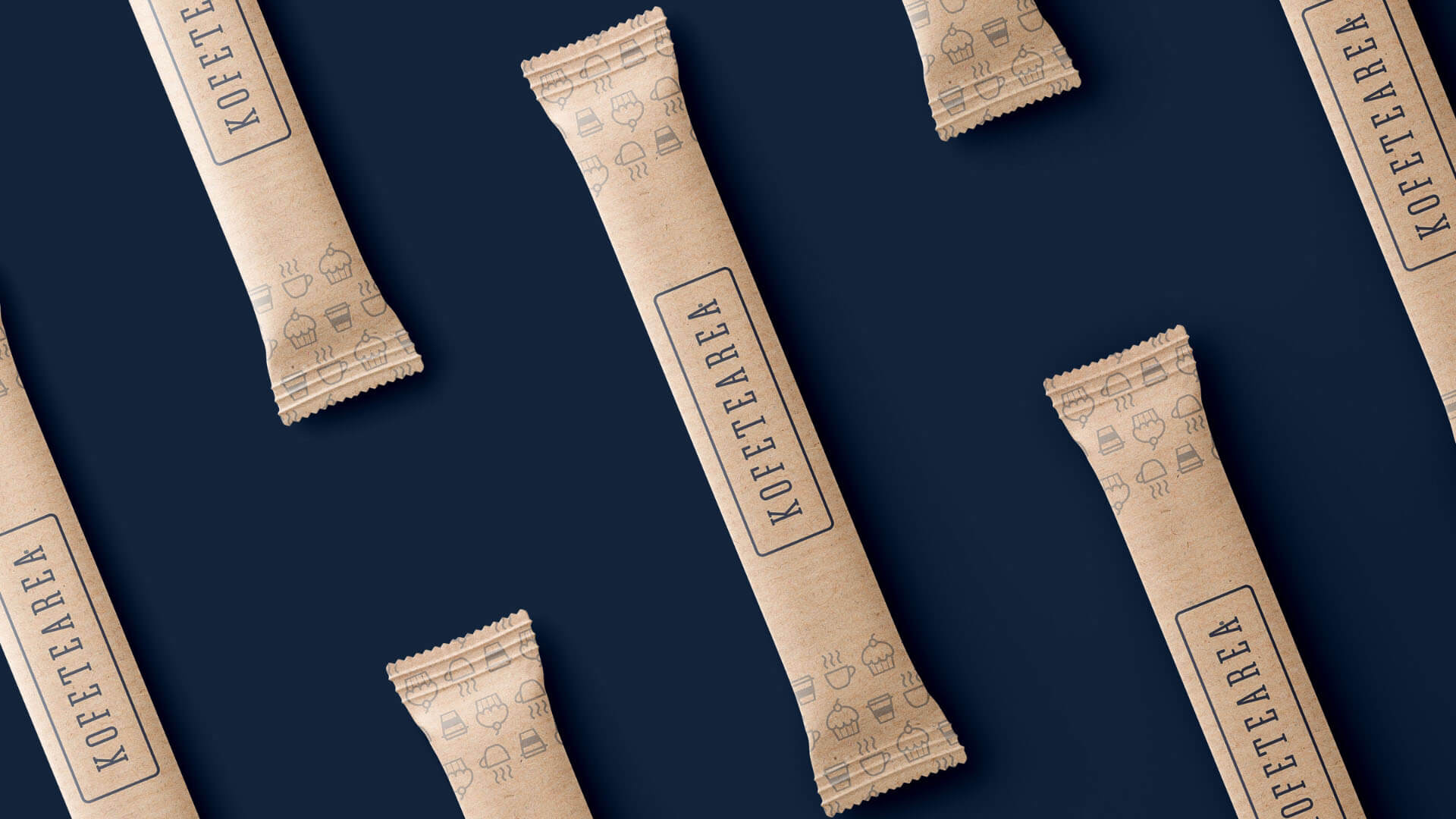
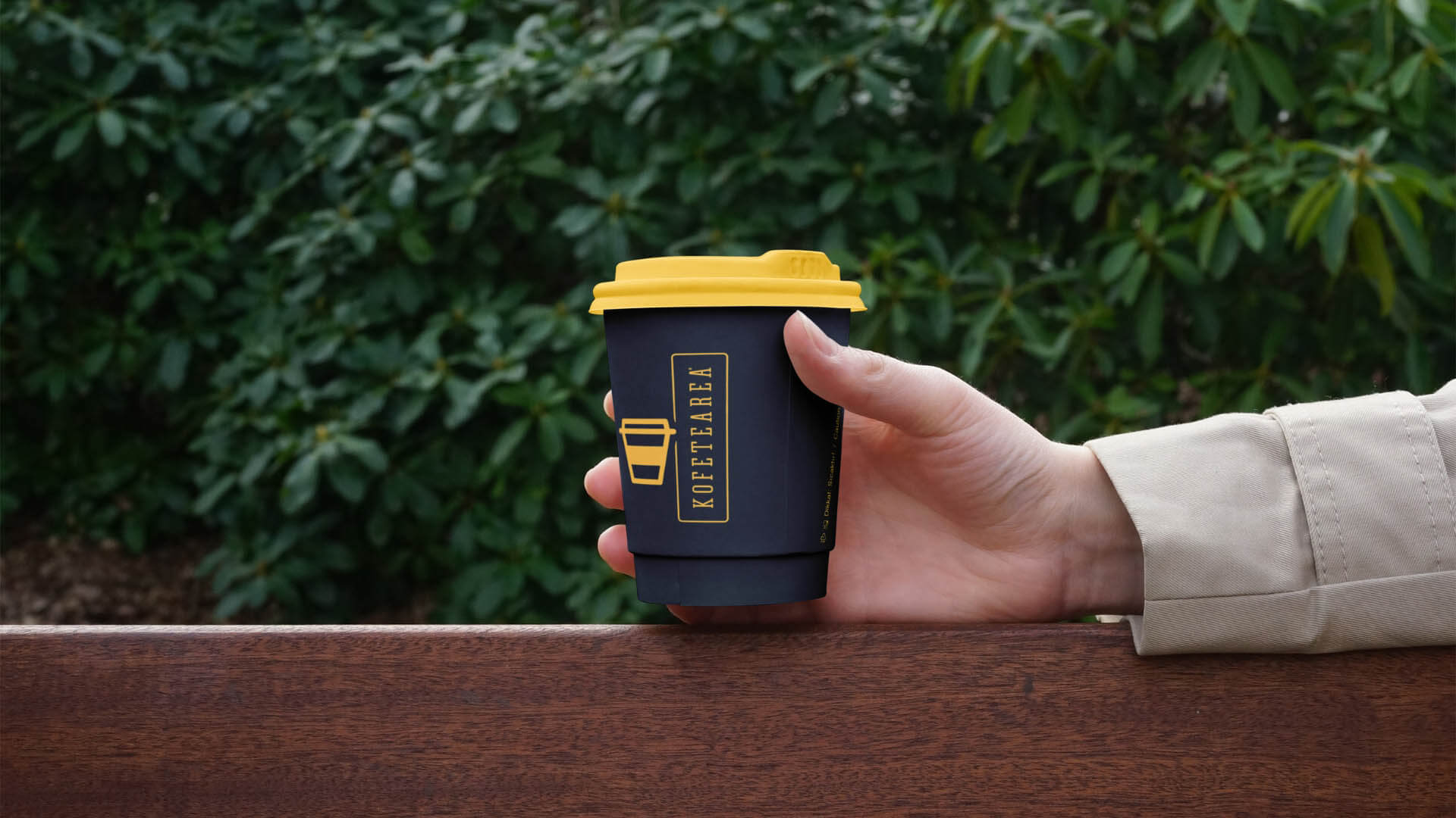
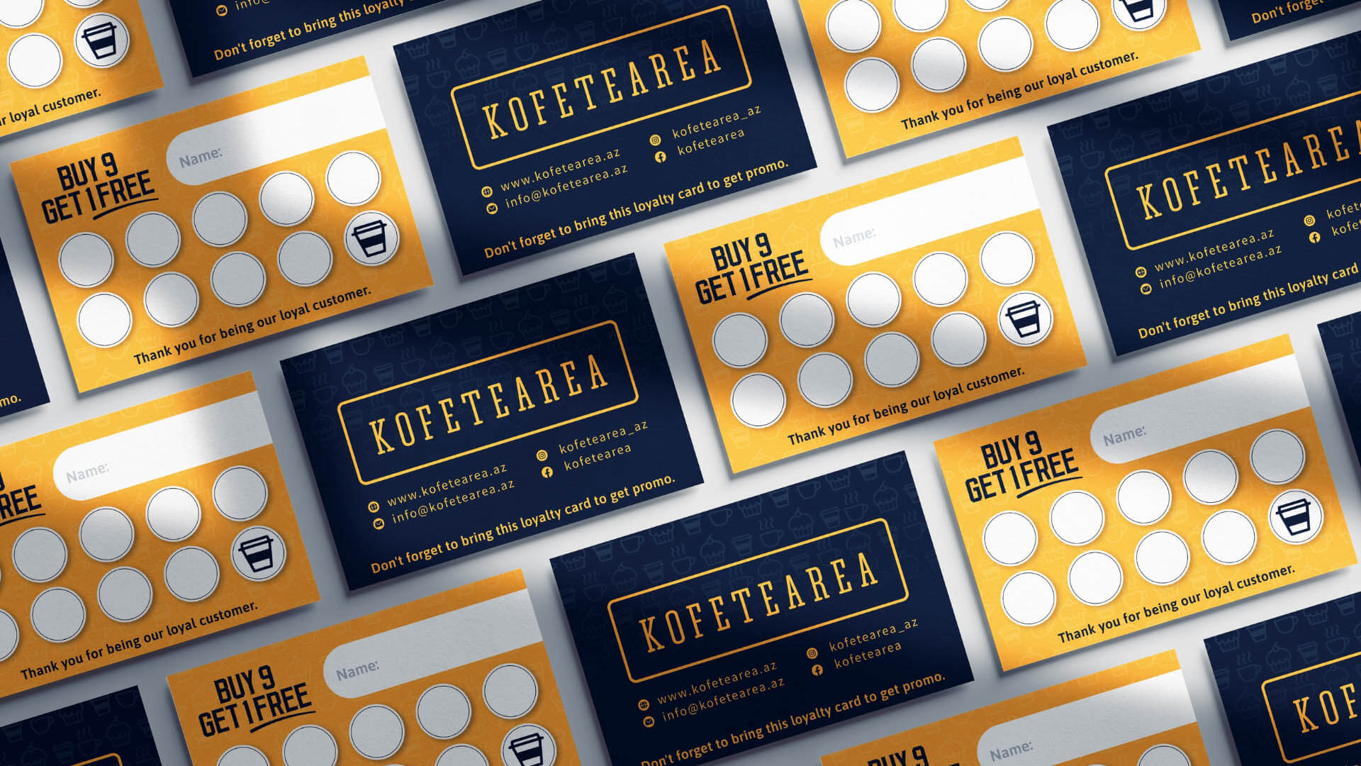
Package Design
Kofetearea’s new package design is a celebration of the brand’s refined and inviting image. The warm yellow, now updated to a more inviting and sophisticated tone, remains a key element of the packaging. Paired with elegant dark blue, the combination creates a timeless and harmonious color palette that conveys a sense of premium quality. We incorporate subtle textures and patterns inspired by cupcakes, coffee and tea cups, adding a touch of depth and tactile appeal. The typography is clear, legible, and modern, ensuring that customers can easily identify and connect with our products. With this package design, we aim to create an unforgettable unboxing experience that leaves a lasting impression of elegance and refinement.
Kofetearea’s rebranding by our creative agency is a testament to our dedication to creating a welcoming and upscale coffee and tea destination. With a fresh logo design, captivating photo shooting, and refined package design, we invite connoisseurs and newcomers alike to join us on an enriching journey of flavors, aroma, and community. Welcome to Kofetearea, where every cup tells a tale of taste and togetherness.
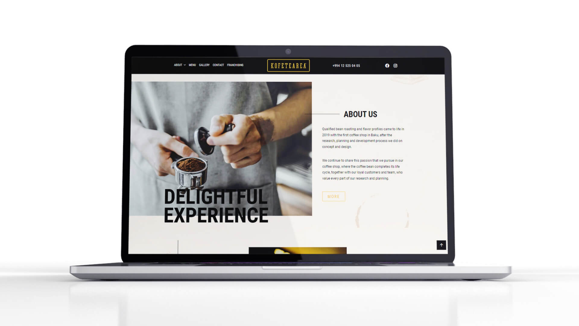
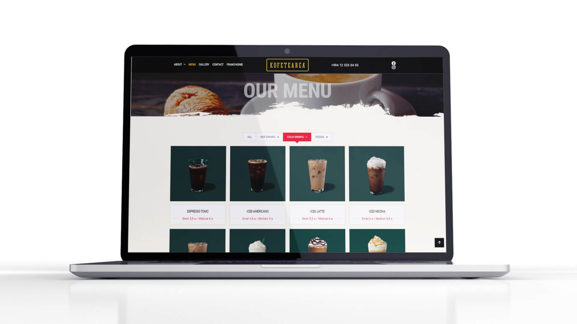
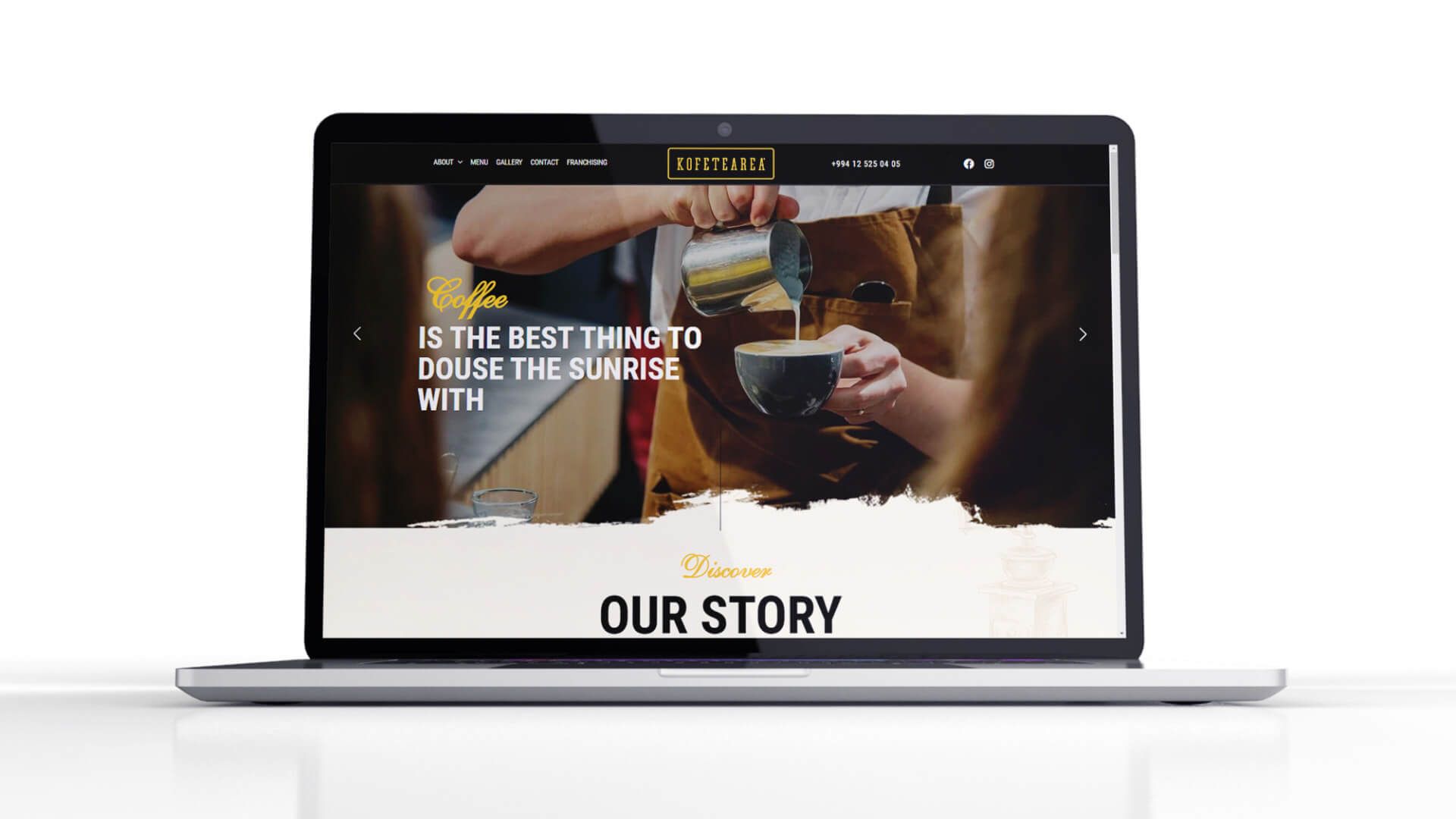
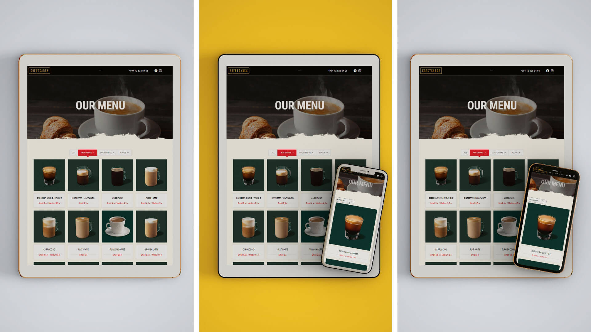
HizmetlerLogo Design, Photo Shooting, Package Design, Web Design