TFC
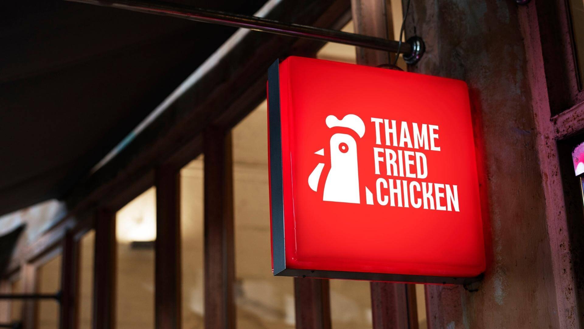
88 Creative’s in-depth study of rebranding and redesigning the “Thame Fried Chicken” brand, Oxford’s premier fried chicken restaurant, showcases its expertise in creating a compelling and captivating visual identity. Through meticulous research and a deep understanding of the brand’s essence, they have crafted a logo that perfectly encapsulates the restaurant’s core values and offerings.
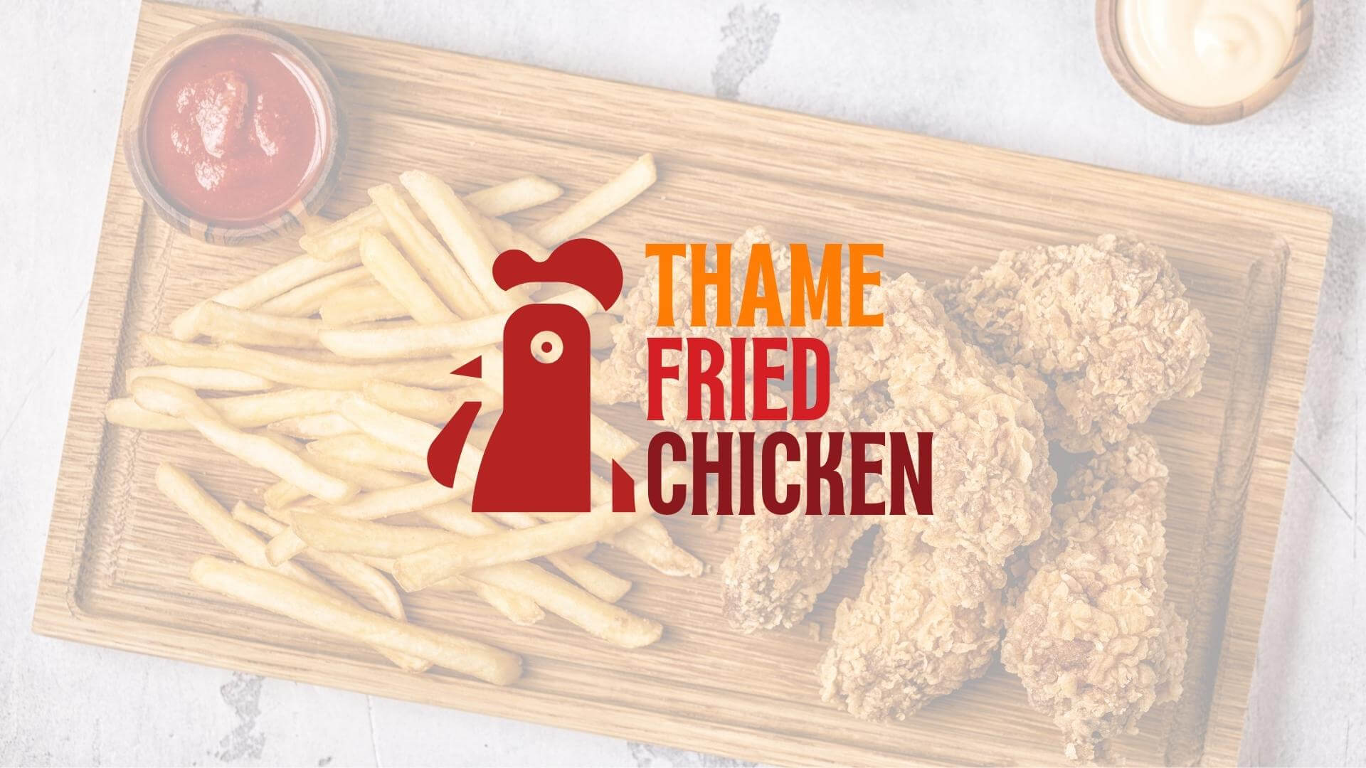
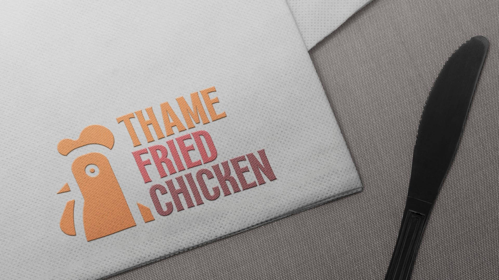
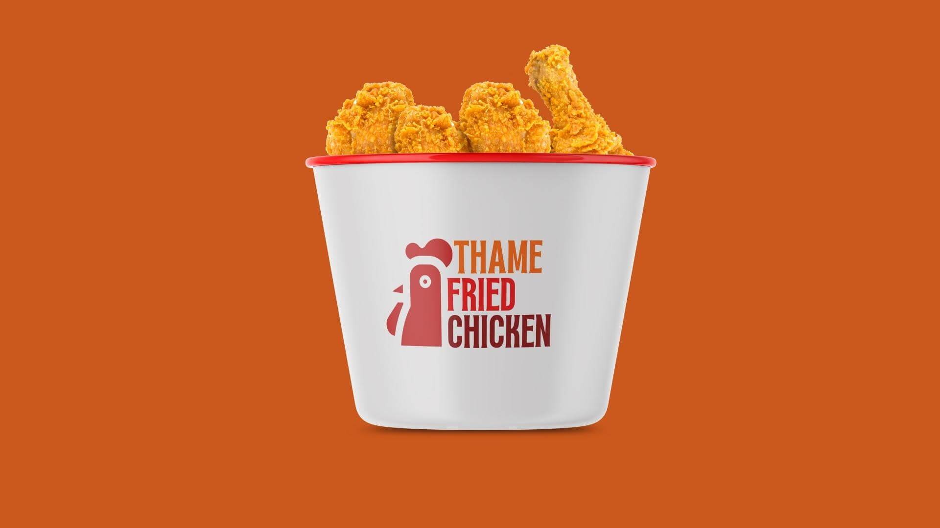
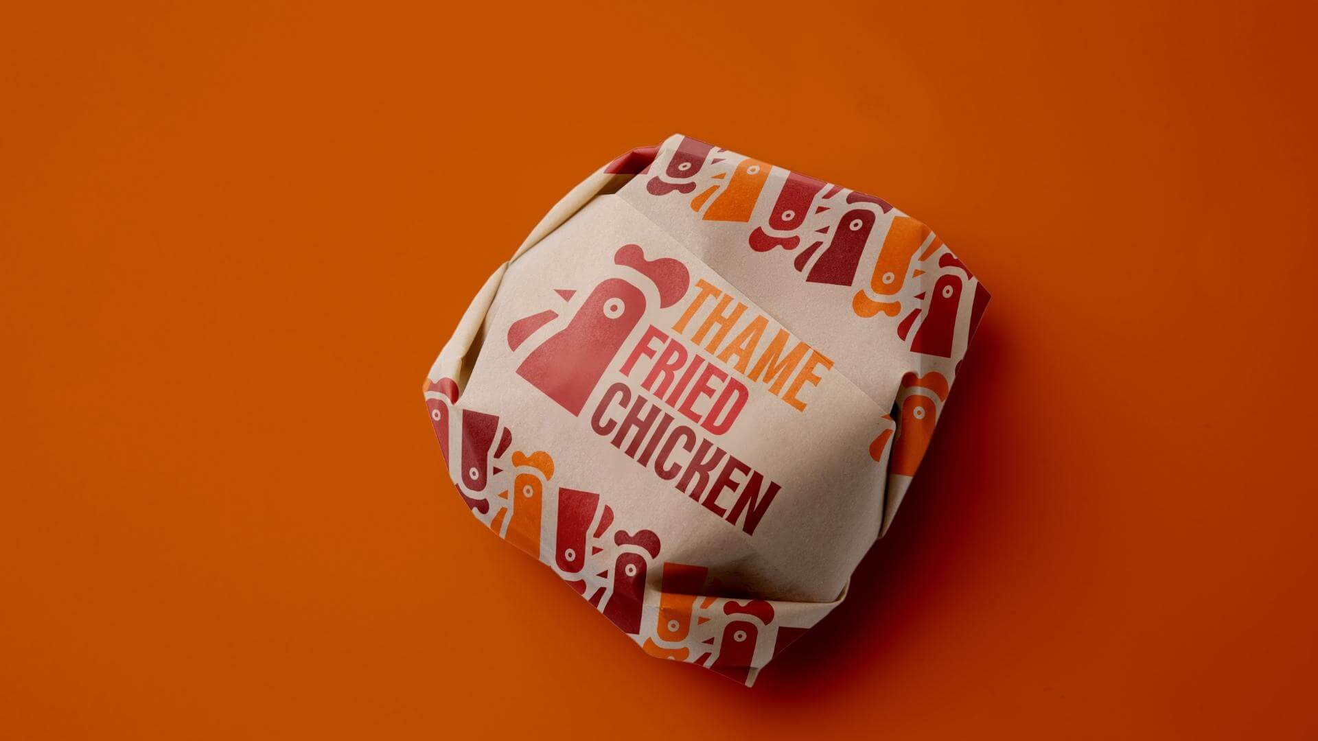
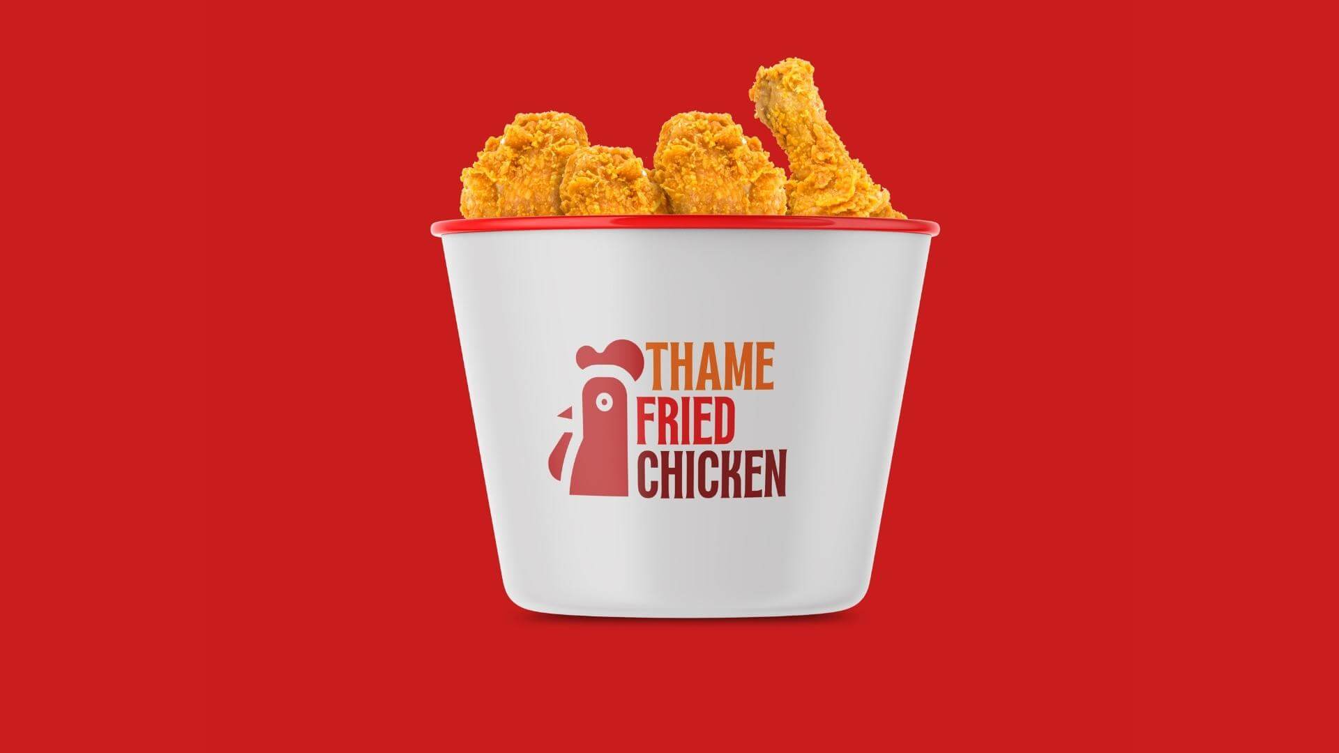
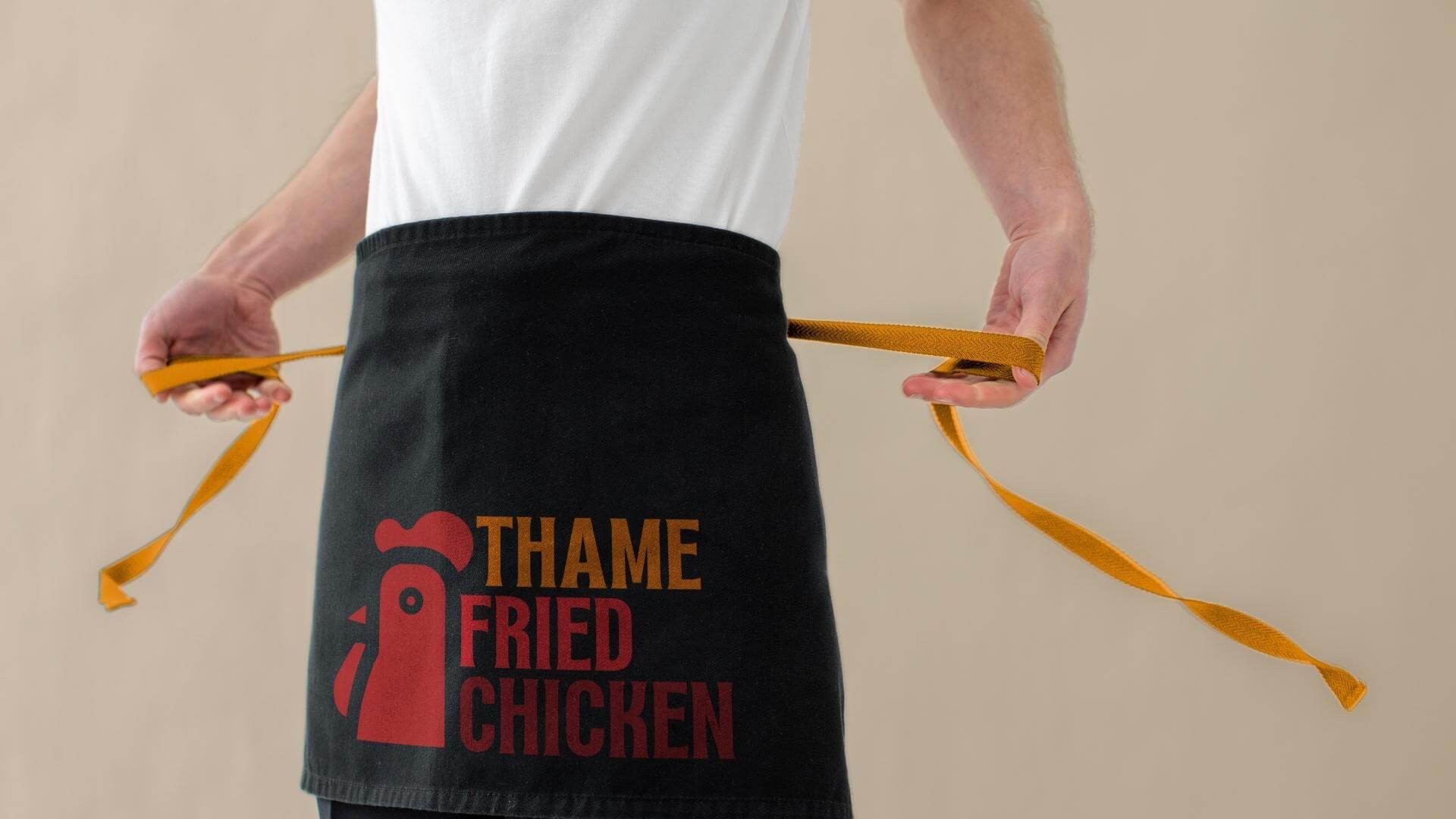
The chosen colors for the logo, warm orange, vivid red, and dark red, have been carefully selected to evoke specific emotions and associations that resonate with the target audience. Warm orange signifies a welcoming and inviting ambiance, reflecting the restaurant’s commitment to providing a friendly and enjoyable dining experience.
Vivid red and dark red, on the other hand, elicit feelings of excitement, passion, and appetite, emphasizing the mouthwatering and irresistible taste of Thame Fried Chicken’s offerings. These bold and dynamic hues serve as a powerful visual cue, drawing customers in and creating a sense of urgency to experience the restaurant’s delectable menu.
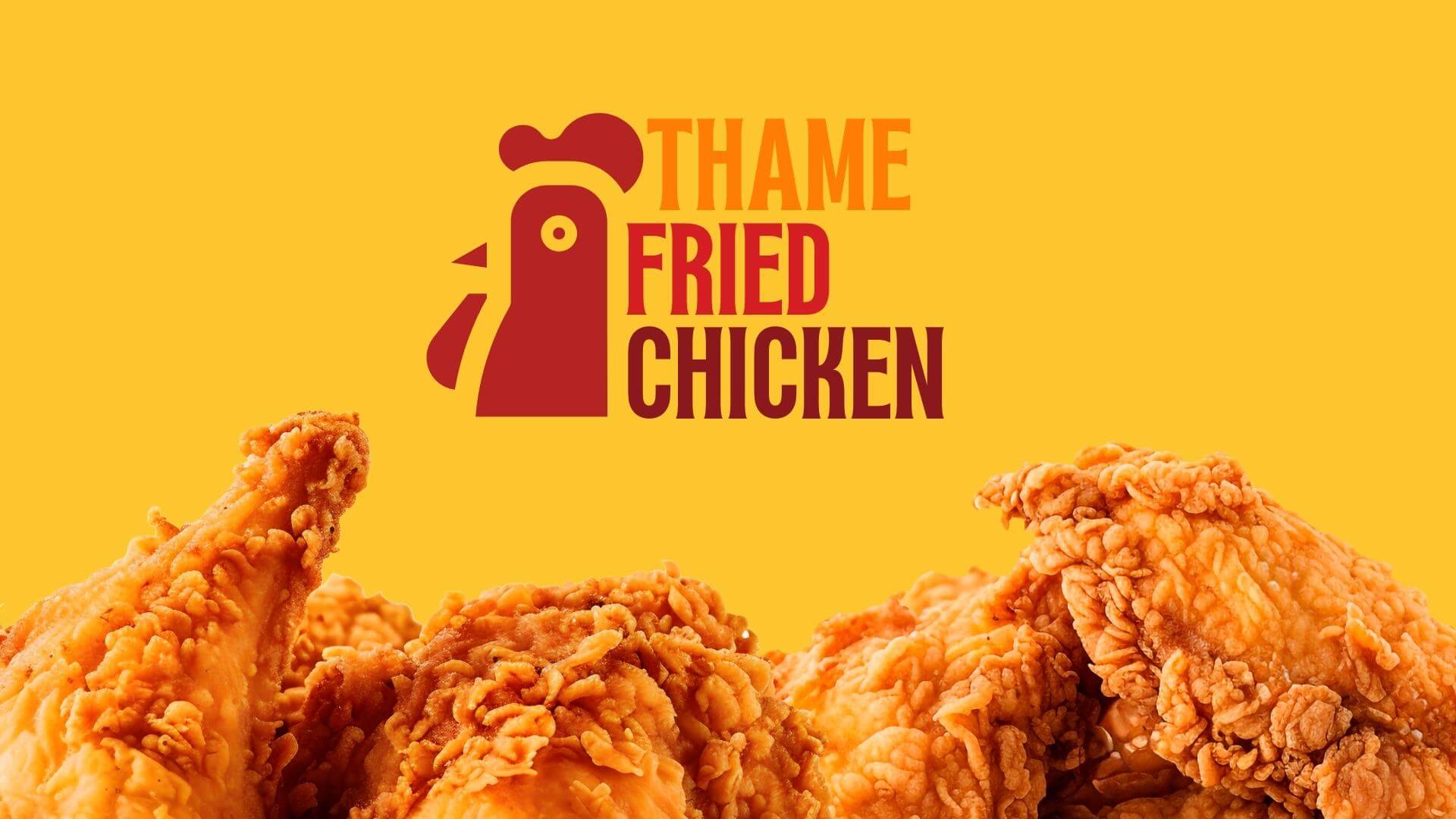
88 Creative’s logo redesign also demonstrates its dedication to modern aesthetics while maintaining the brand’s authenticity. By combining classic typography with contemporary elements, they strike a perfect balance between tradition and innovation. This strategic approach ensures that existing customers still feel strongly connected to the familiar brand while attracting new, younger audiences who appreciate modern design.
Furthermore, their study considers the brand’s overall positioning and how the redesigned logo will resonate with its target demographic. It takes into account factors like customer preferences, industry trends, and competitor analysis to create a unique and differentiated identity for Thame Fried Chicken.
The final result of 88 Creative’s study is a visually captivating and cohesive brand identity that sets Thame Fried Chicken apart as the top fried chicken destination in Oxford – UK. The logo’s warm orange, vivid red, and dark red color scheme, paired with a balanced fusion of tradition and innovation, reinforces the restaurant’s status as a beloved local icon while positioning it for continued success in a competitive market.
HizmetlerLogo Design, Photo Shooting, Package Design